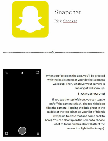
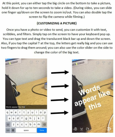
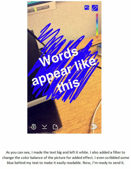
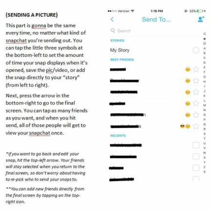
Snapchat Tutorial
Twelve Days of Photoshop
|
|
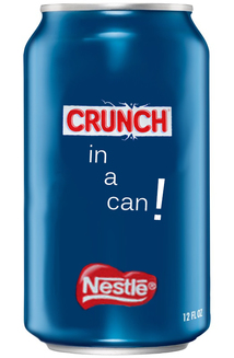
Illustration Friday - Wet
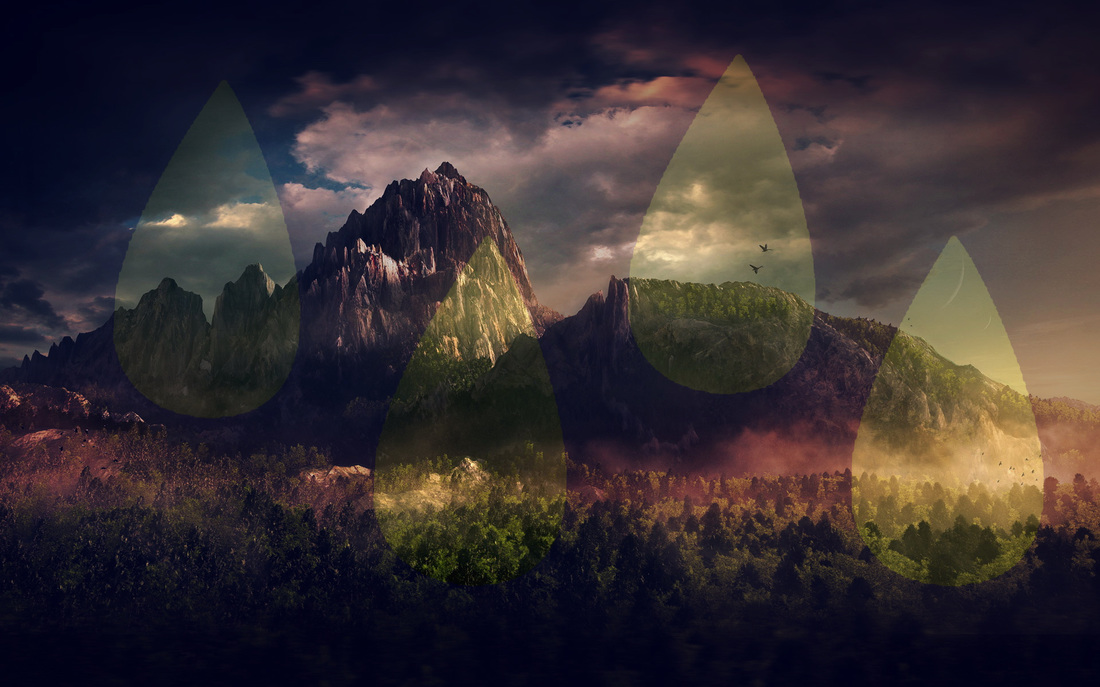
Illustration Friday - Punch
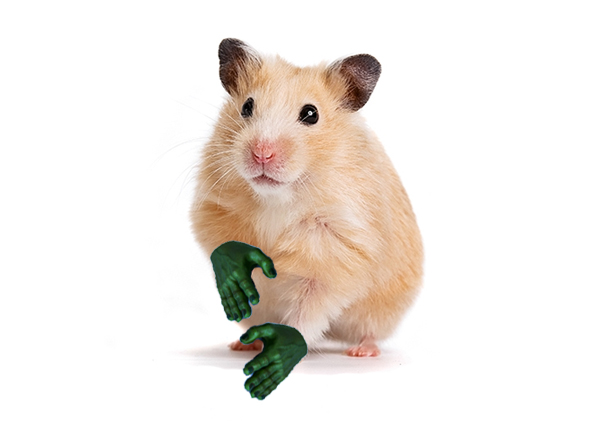
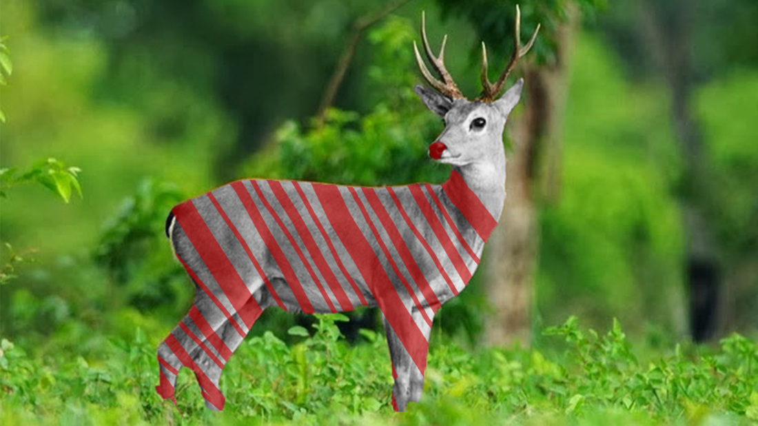
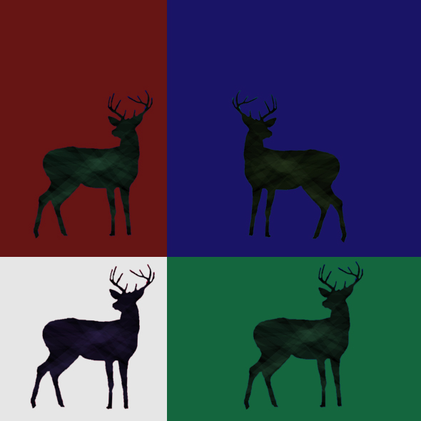
Illustration Friday - Animal
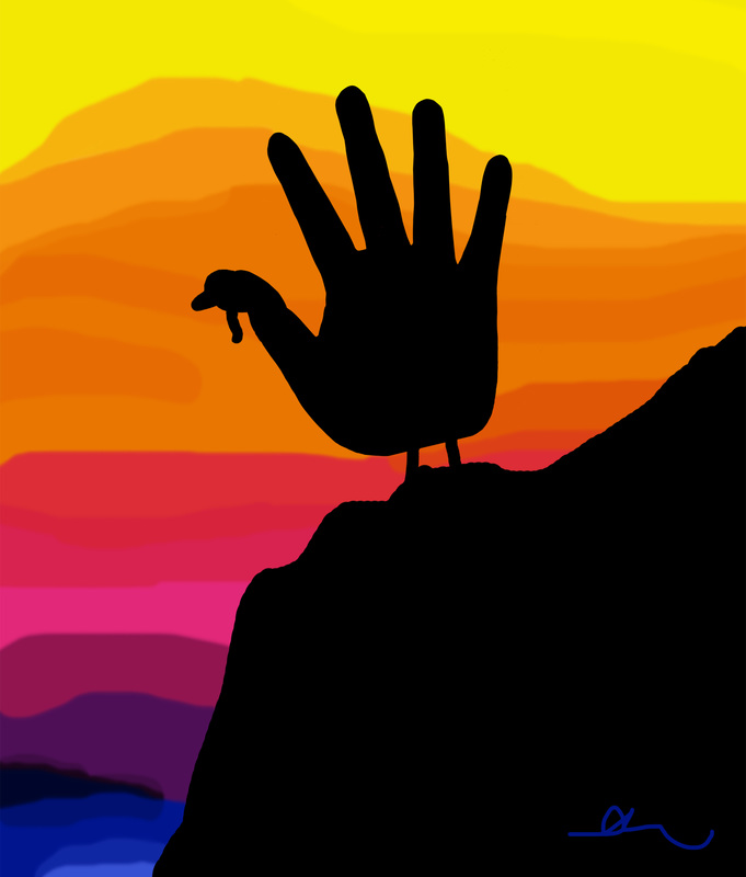
Hand Turkey
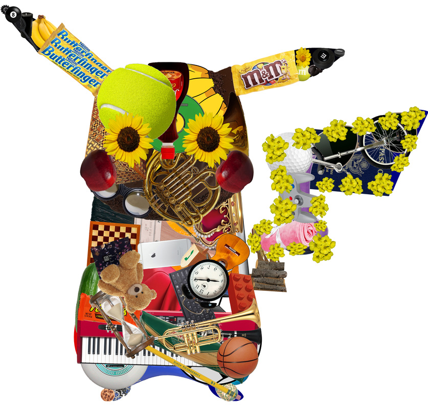
Objects Make a Whole: Pikachu
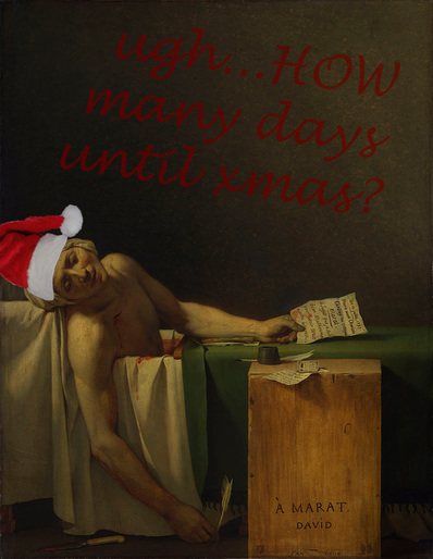
Theme: Altered Portrait
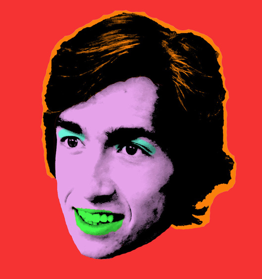
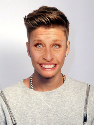
There were a bunch of options, but this Andy Warhol style looked the most fun. I used a picture of Derek I took a while back. I'm gonna print this out give it to him for Christmas or something, probably.
Theme: Translucent
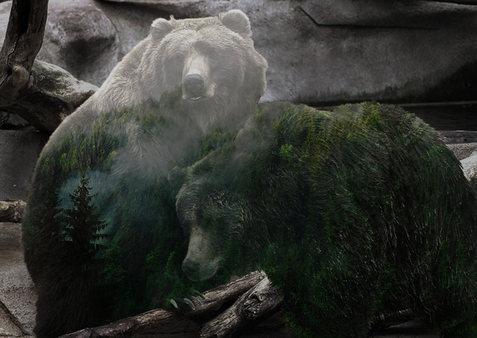
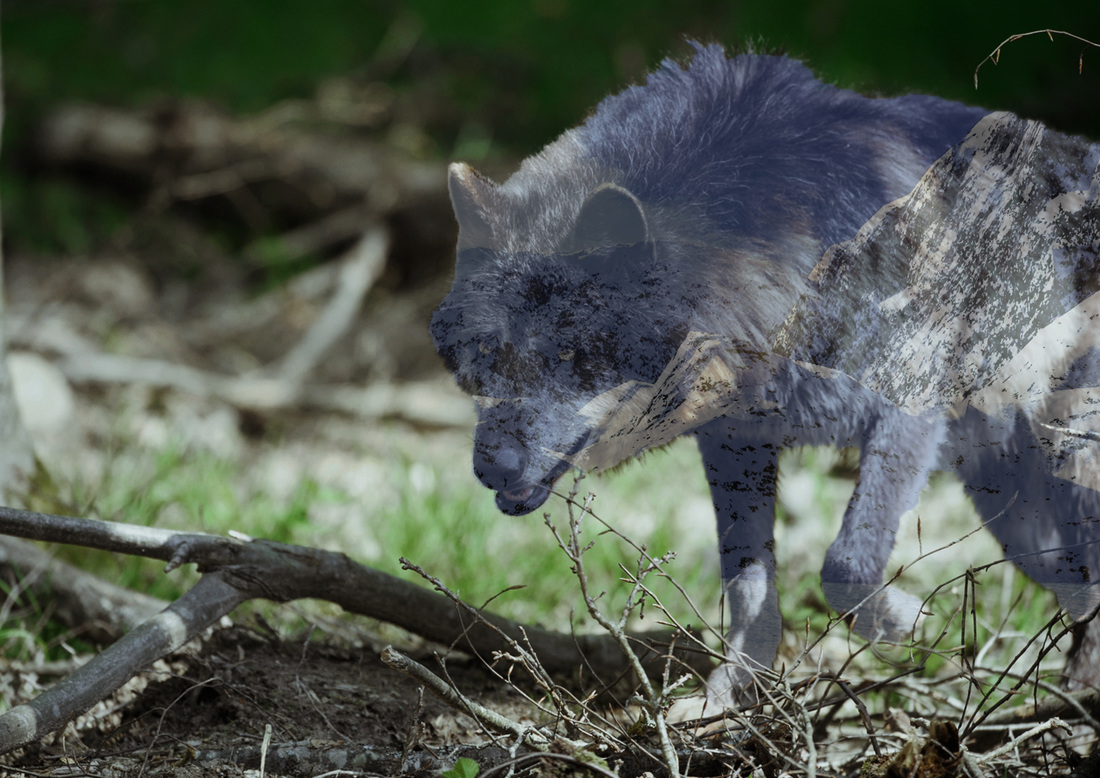
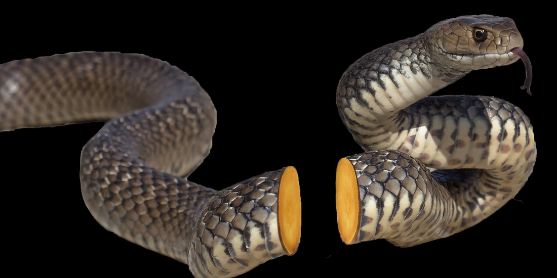
This was really fun to make. All I did was play around with selections and layers, and changed opacity of the top layer to make it look like it was inside the animals. I also edited the backgrounds
Edible Architecture
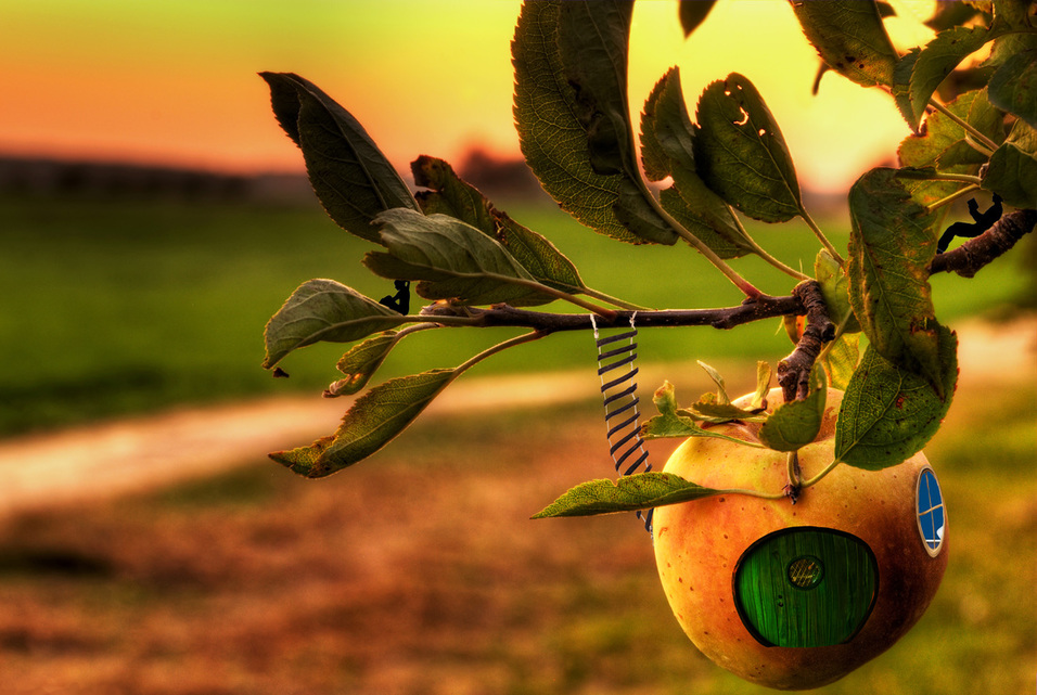
I hid two shadowy sprites on the branch. They live in the peach-house. It was hard manipulating the shape of the ladder and the coloring of the door to blend in. I used the burn tool around the window to make it pop a little. I made layers of some leaves and parts of the branch to put on top of some of the things I added (for example, I put the leaf and peach back in front of the ladder).
Illustration Fridays - star and ink
Cinemagraphs
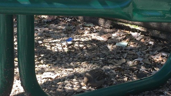
I had never heard of cinemagraphs before this project, and I'm pretty upset about it. They're like gifs but more entrancing. I could lose myself in a well-made one for a long while. It was difficult to capture moving subjects and keep my camera still to record the footage I needed to make these, but it was worth it. I was lucky to capture a bird! Anyway, I learned all about making animated gifs and things in photoshop during this project, which was really cool. I feel like I can do a lot more with photoshop now, and I would love to make more cinemagraphs. If I could film anything I want, I would try to find some really intimate settings and some big expanses to see if I could create a certain vibe. Maybe I could set them to music, or write a song based on a cinemagraph?
Newimals
More Illustration Friday - Villain and Prize
|
|
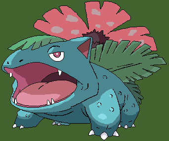
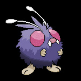
I chose to do pokemon pixel-overs for these weeks. Venusaur looks pretty threatening so I figure he could be a villain. Venonat reminds me of winning the bug-catching-contest in Pokemon Crystal, so he represents "prize".
"Fake Product" Can Labels (photoshop)
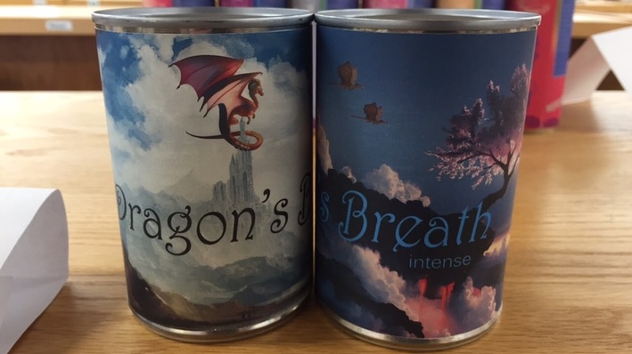
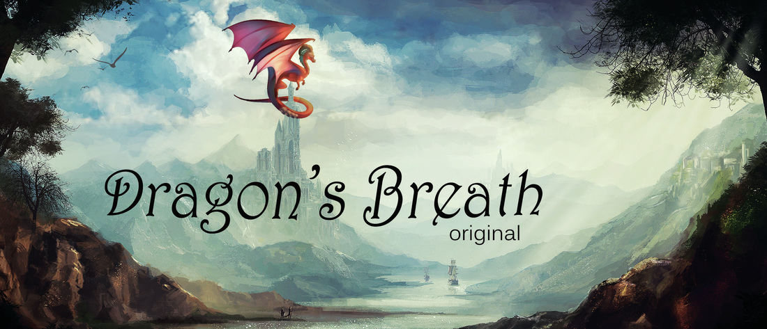
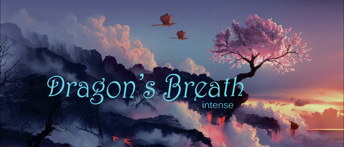
This was really fun. Each of these took under an hour to make. I got the pictures from google images. I had to edit the dragons into the pictures in ways that looked natural, but still caught the eye from a quick glance. I'm really happy about the fonts I found. Once I got the image put together, I placed the text on top on a separate layer; then, I added an adjustment layer below the text and messed with the curves until the image was vibrant and made the text pop.
Apex Logo (illustrator)
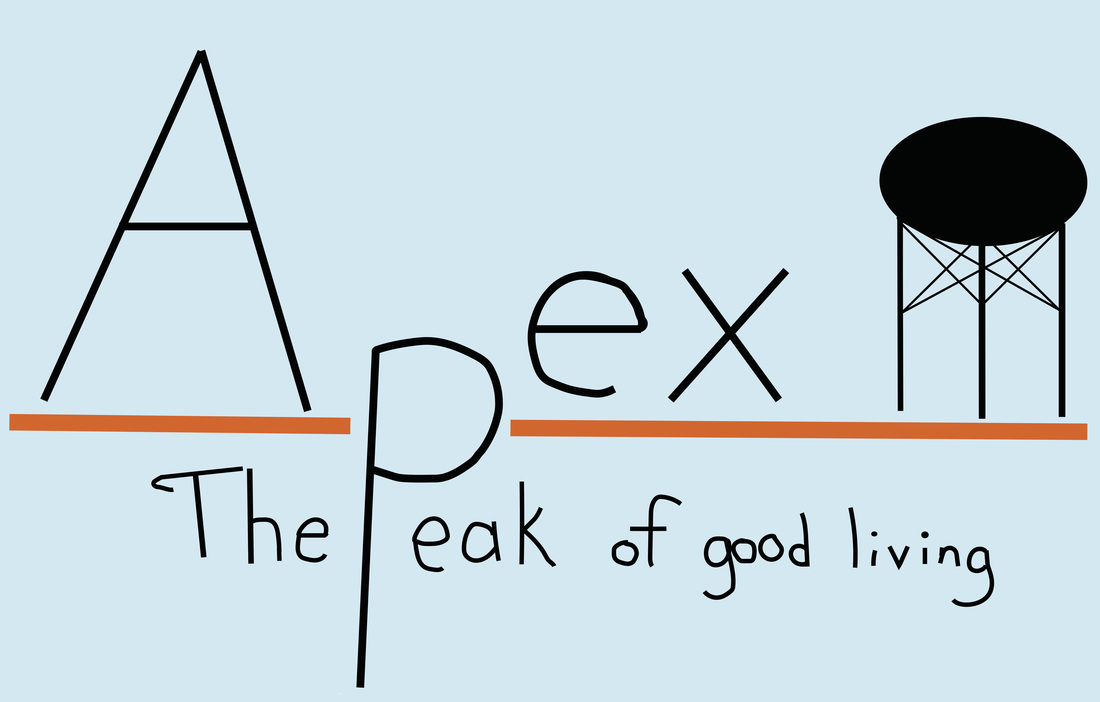
I sketched out a number of ideas before trying to put the design above into a digital format. This was my first time using Adobe Illustrator, and it was really frustrating. I was limited by the fonts available to me, so I simply uploaded my sketch and tried to trace over it (though, now that I think about it, I could have searched the web and downloaded a new font that fit my needs). Everything was tricky. As someone with experience with programs like photoshop and gimp, Illustrator did not come naturally to me! Using the line tool was confusing. Adjusting color preferences or stroke size was difficult to figure out. Using the eraser tool was an exercise in futility. Every little move I made was set away on a sublayer underneath the main layer (and another thing, I couldn't figure out how to change the levels of the layers!). When I tried to erase things, whole chunks of color would disappear, and it wasn't near the size I had selected for the eraser. I guess it was good to know that illustrator is a completely different vibe; next time, I'll be prepared to slog through an art project and hopefully come away a little more experienced than before.
Having said that, I feel like the logo wasn't really suited to using Illustrator. Had I chosen a logo based around a big circle or a graffiti-style layered town-theme stores suggesting the idea of a cube or something, I'm sure Illustrator would have been helpful with it's layered/sublayer structure; also, if I had more experience with this program or watched youtube videos, I bet I would have a better idea of how to best use the art program.
Having said that, I feel like the logo wasn't really suited to using Illustrator. Had I chosen a logo based around a big circle or a graffiti-style layered town-theme stores suggesting the idea of a cube or something, I'm sure Illustrator would have been helpful with it's layered/sublayer structure; also, if I had more experience with this program or watched youtube videos, I bet I would have a better idea of how to best use the art program.
Stop Motion Project
This is the sum of about five days of drawing on a whiteboard. Every time I drew a scene, I would re-watch it and be surprised by how short the sequence was. It was still rewarding to see an entertaining little video as the reward for all the hard work. Throughout this project, I began to understand how to use the drawn medium to bend the rules of reality (for example, I love the parts when everything crumbles to dust). After about a week away from this project, I'm actually eager to do this again sometime - without the time constraint of a school deadline.
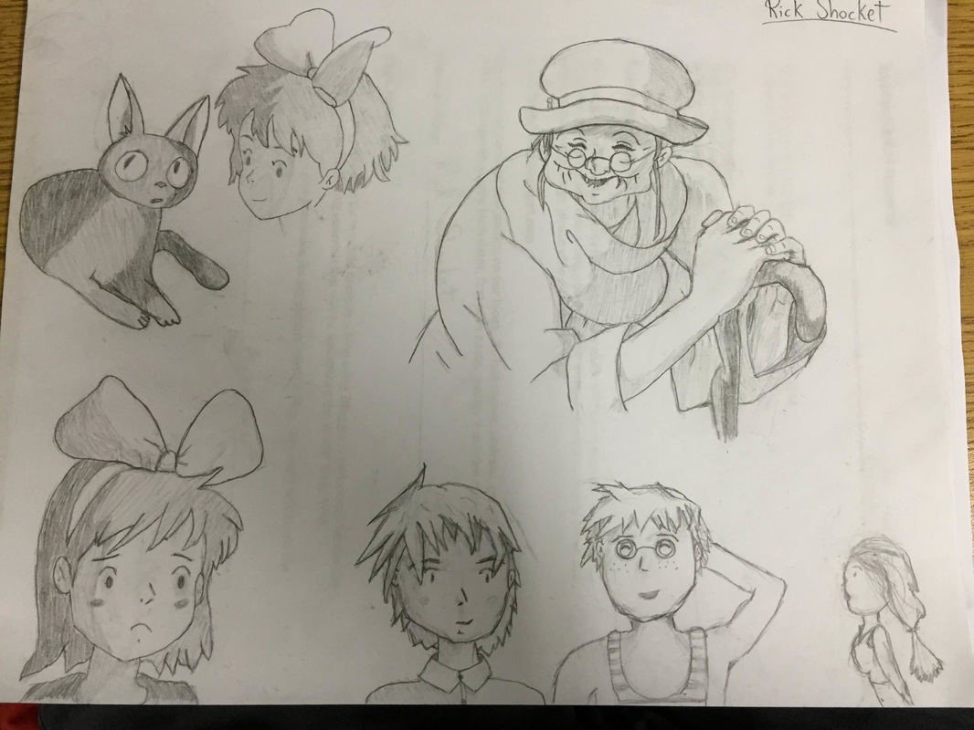
Stop Motion - day 1 - Research
Find a stop motion artist you enjoy the work of. Why did you pick them? What makes their work different from others? Give me some history about them. Where are they from? What have they made? The more information you can give me the better.
Taken directly from the artist's Wikipedia page: Suzanah (Suzie) Clare Templeton (born in Hampshire, England 2 August 1967) is an award-winning British animator. Her film Peter and the Wolf has won several awards, including the Academy Award for best Short Film (Animated) in 2008. I chose to do a little background research on Suzie Templeton after looking up a list of notable stop motion artists, having her name catch my eye, and previewing her work. I love the clear, beautiful world she created in "Peter and the Wolf." This work is a whopping 30ish minutes long - though it's narrated in Russian - so I simply let myself enjoy the art and music. The emotions expressed by the characters was astounding. The boy's big, expressive blue eyes often caught my attention, and his swan friend is super-lovable. The music and sounds were engaging, and I definitely want to watch more of her work.
Taken directly from the artist's Wikipedia page: Suzanah (Suzie) Clare Templeton (born in Hampshire, England 2 August 1967) is an award-winning British animator. Her film Peter and the Wolf has won several awards, including the Academy Award for best Short Film (Animated) in 2008. I chose to do a little background research on Suzie Templeton after looking up a list of notable stop motion artists, having her name catch my eye, and previewing her work. I love the clear, beautiful world she created in "Peter and the Wolf." This work is a whopping 30ish minutes long - though it's narrated in Russian - so I simply let myself enjoy the art and music. The emotions expressed by the characters was astounding. The boy's big, expressive blue eyes often caught my attention, and his swan friend is super-lovable. The music and sounds were engaging, and I definitely want to watch more of her work.
Brushes - Day 2
What your inspiration was. Why did you create it the way you did?
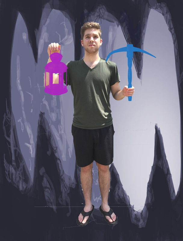
Originally I was going for the cheesy "I caught a fish" pose, but decided to see what else I could put in my hands. The brushes used are: pickaxe and lantern.
What problems you came across.
Deleting the background was a pain because I wasn't photographed in front of a blank background. Other than that, it was just a matter of being patient and doing a thorough job. Oh - also sometimes photoshop would be slow on the computer, and quickselect would be slow or glitchy ( you can see the lines at my feet - I thought they were leftover "select box outlines" but they WEREN'T).
If you were to do this again, how would you change it?
I would use the brushes to make a pretty watermark or swirly ribbons of color floating around me instead of using them to make props. Although I'm happy with the cartoony vibe the piece has now, it would be nice to see how far I can push custom brushes in serious digital art.
Anything else you want to include. Help me get in your head while I am grading so I can give you the most fair grade possible.
I slightly erased the brushes around my hands to make it look like I was holding things. That should satisfy the "messing with layers" part of the assignment. Also I found a fun image to use as a background. Photoshop would occasionally make things difficult and leave traces of select boxes on my image, so I had no idea that the lines around my feet were real.
Custom Brushes - day 1 test
How does this relate to you?
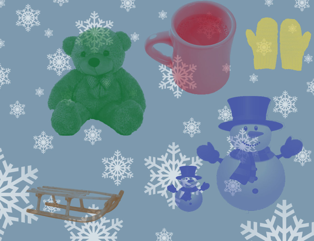
I had winter on the brain today, so I made a festive image. I guess you could say that the teddy bear has brown hair and likes to cuddle, just like me. The snowman looks vaguely like a human if you squint, and so do I. People ride sleds, and I'm one of those. Hot chocolate is delicious and I would drink it twice a day if I had a little less self-control, and mittens are like gloves but lumpier, but people still wear them in the winter to stay warm. The snowflakes in the background are also done by a custom brush (it snows in the winter), and the blue background was done by a default brush but it's a cool color. I bet you didn't think I knew about cool/warm colors because I'm a guy. Surprise surprise.
I had winter on the brain today, so I made a festive image. I guess you could say that the teddy bear has brown hair and likes to cuddle, just like me. The snowman looks vaguely like a human if you squint, and so do I. People ride sleds, and I'm one of those. Hot chocolate is delicious and I would drink it twice a day if I had a little less self-control, and mittens are like gloves but lumpier, but people still wear them in the winter to stay warm. The snowflakes in the background are also done by a custom brush (it snows in the winter), and the blue background was done by a default brush but it's a cool color. I bet you didn't think I knew about cool/warm colors because I'm a guy. Surprise surprise.
Fun Friday - 1 - Face Swap (Ellen/Bieber)
Pretty Scary
Illustration Friday - 1 - People
Angry Pancakes
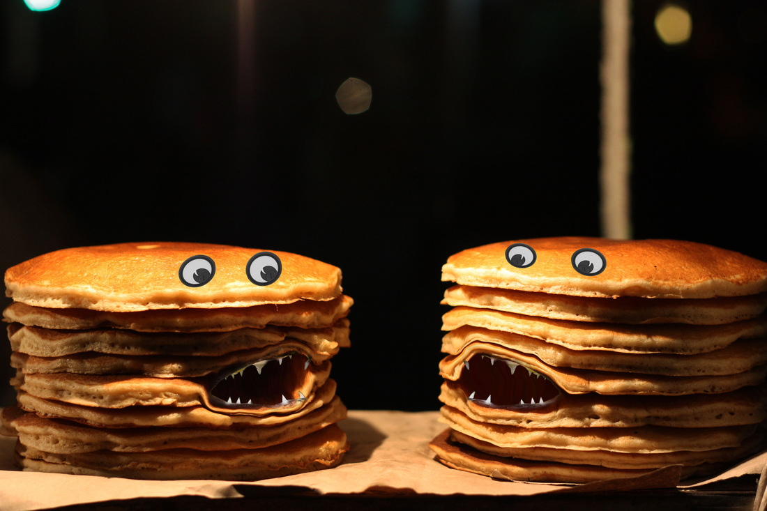
What did you find most difficult about this project?
It was hard to open the pancakes in a way that seemed natural. If I weren't careful, I would easily find myself with a too-squished pancake. I found myself stressing over making the transition from mouth to pancake as "natural" as possible.
How did you overcome these problems?
At first, I kept the big fish lips from the mouth, but they seemed out-of-place on such a beautiful image of pancakes. I ended up taking basically all of the lips away, and fading the rest into the edge of the nearest pancake. Also, I found myself subtly adjusting lighting on the mouths to fit with the tricky lighting on the pancakes.
If you were to redo this project, what would you change and why?
I would be more careful with my initial spreading of the pancake flaps. The bottom lip on the left stack was stretched too thin. I might also want to add appendages of more accessories to the pancakes to really turn it into a wacky creature.
Clone Me
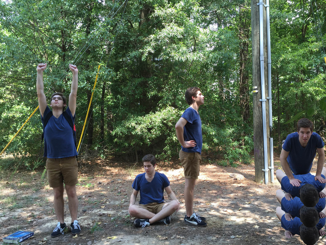
What did you find most difficult about this project?
Definitely visualizing the space I was taking up and moving to fill new areas while my friend was taking pictures. It was one thing to have a silly idea, it was another to make it a reality. I loved the picture of myself lying face-down, but it was in the way of the other clones, so I had to find a way to move it.
How did you overcome these problems?
I ended up just going with the flow and taking what pictures liked - that also worked - from the photo shoot. Once I erased 100% of the background from the lying-down picture, I was hit with a burst of inspiration - why not re-use what already worked? After making a beautiful stack of Ricks, I removed the background from another picture to put on top.
If you were to redo this project, what would you change and why?
If I had the chance to redo this, I might bring a few changes of clothes. I would definitely have a rough sketch of what I wanted the final image to look like, so I could be a lot more efficient and effective with my time with the camera. I would definitely keep the pile of clones on the right, though.
